
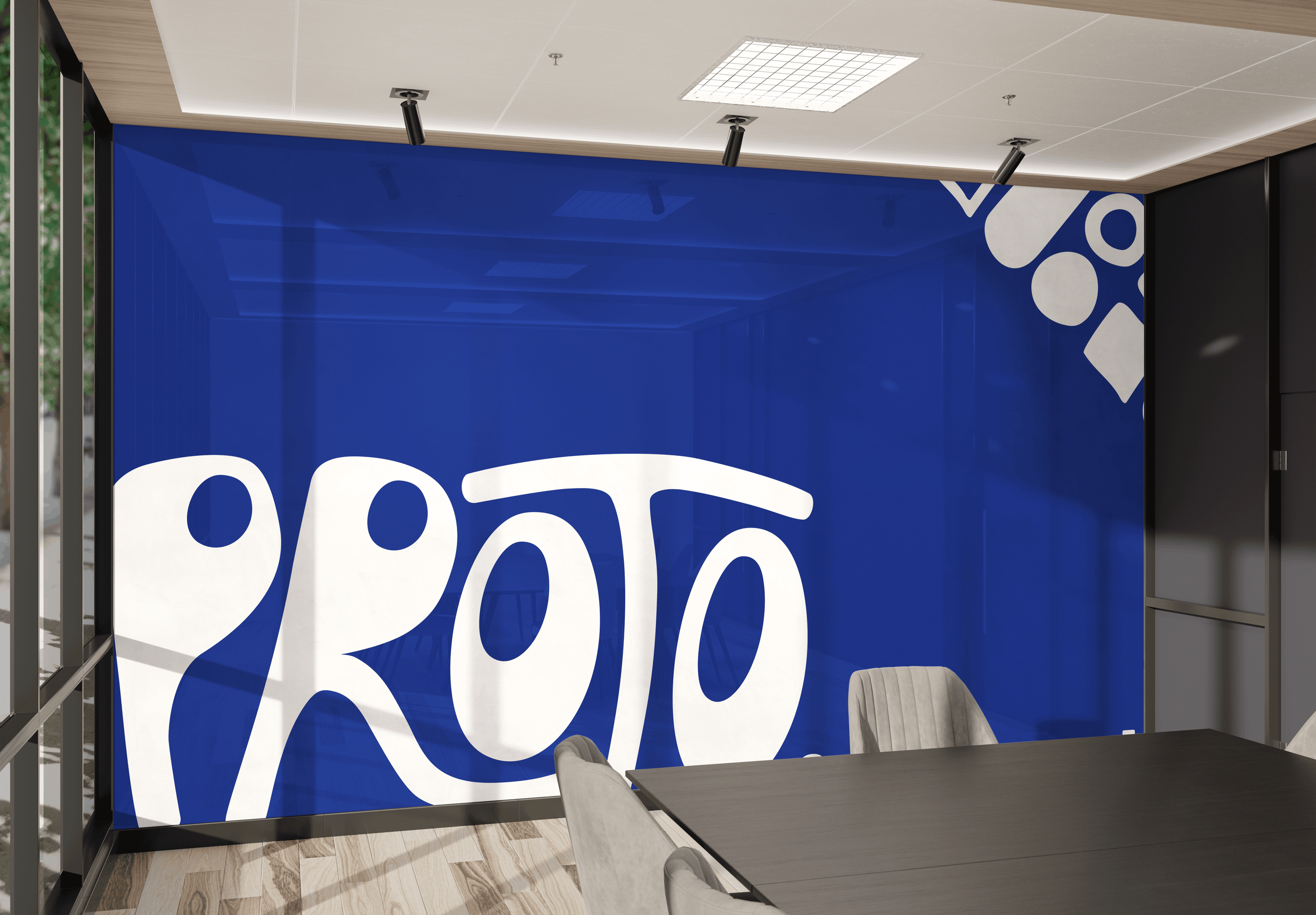
PROTO. STUDIO
REBRAND
BRAND IDENTITY
This project was the chosen design concept!
//
This project was the chosen design concept! //
About the project
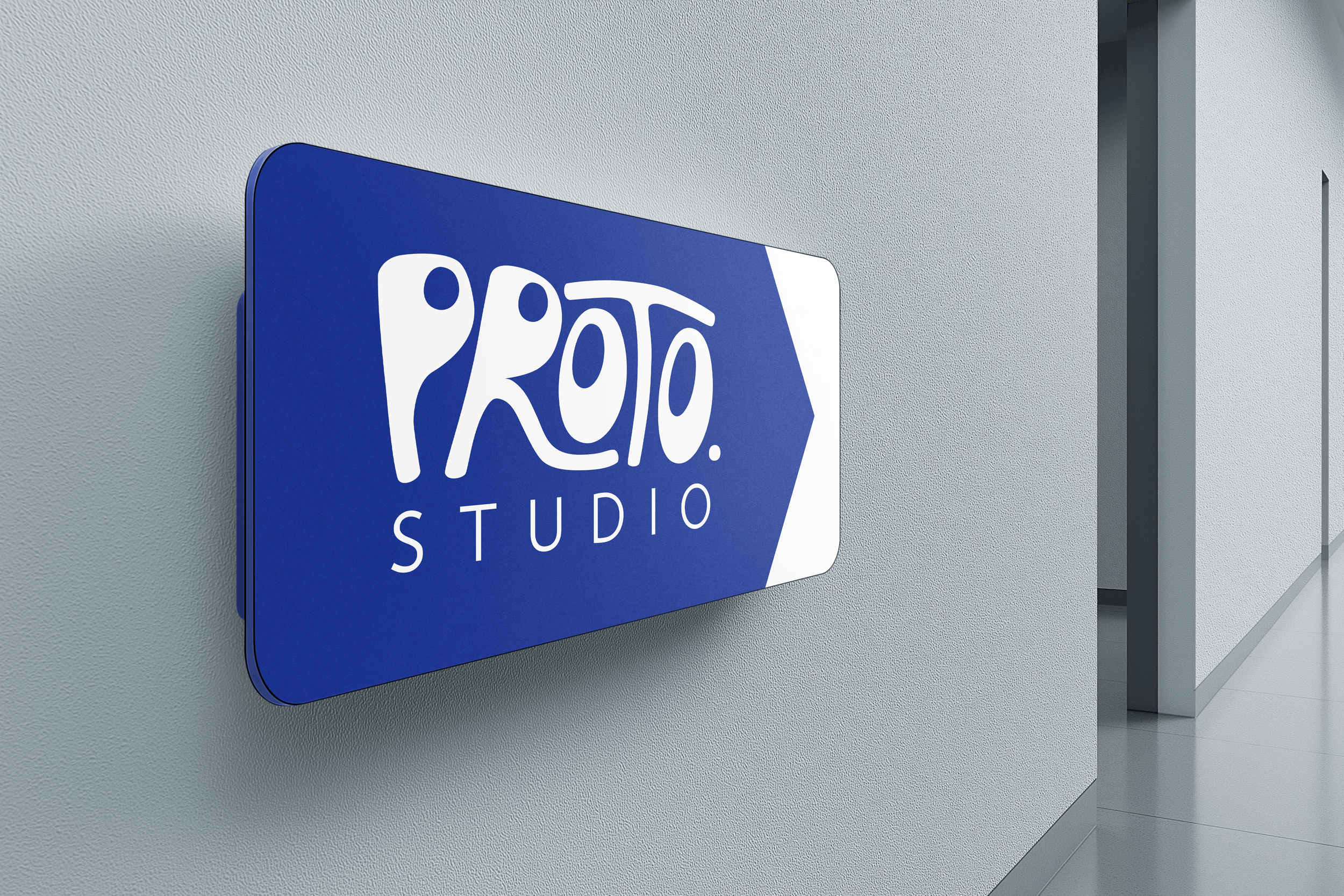
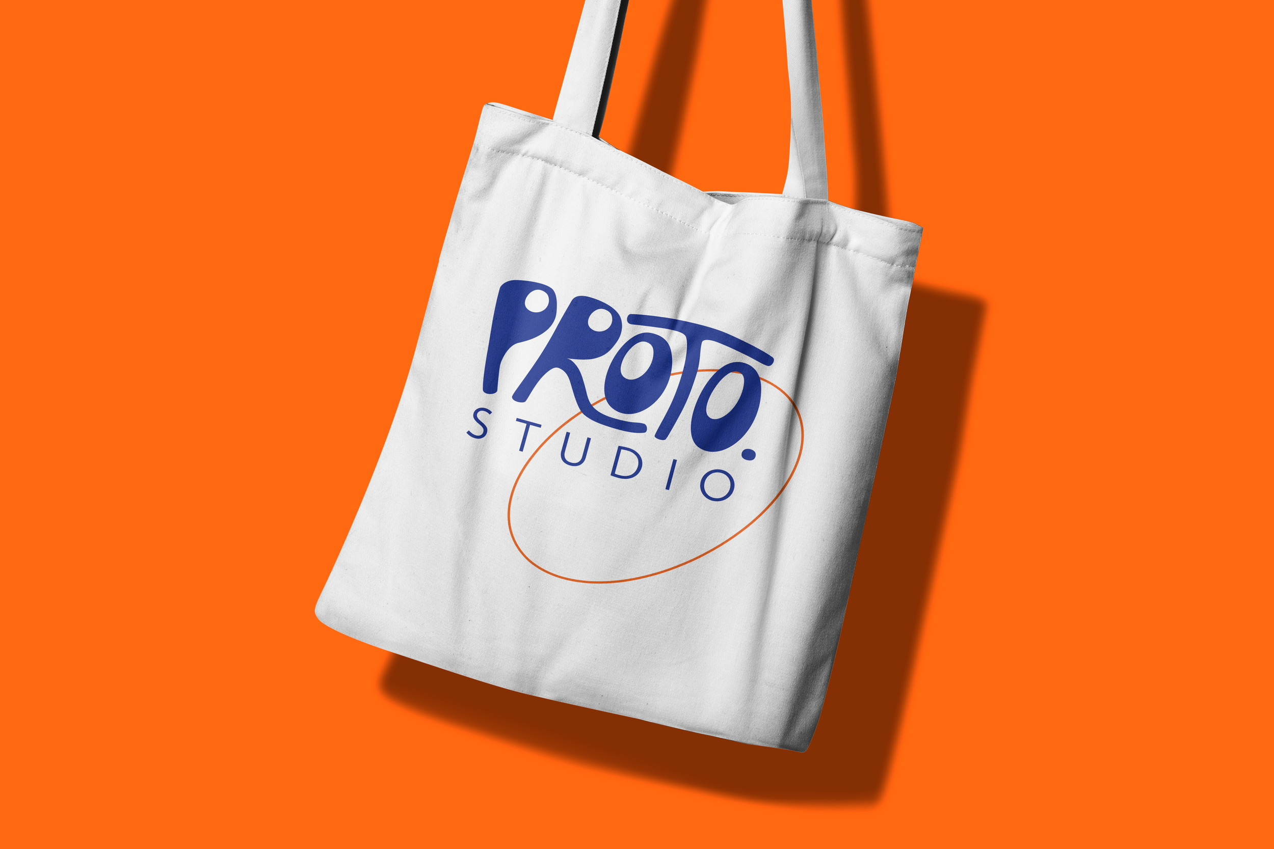
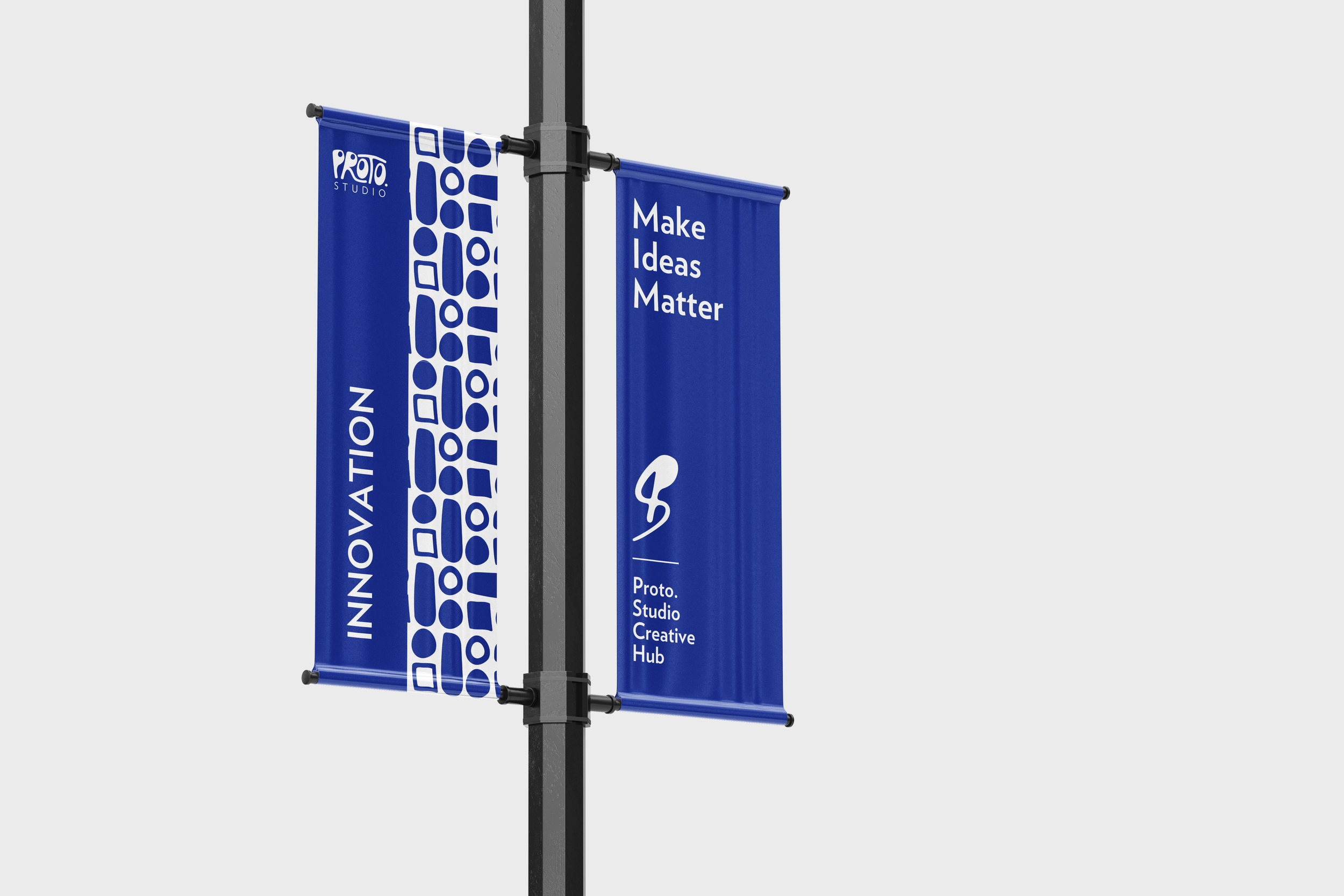
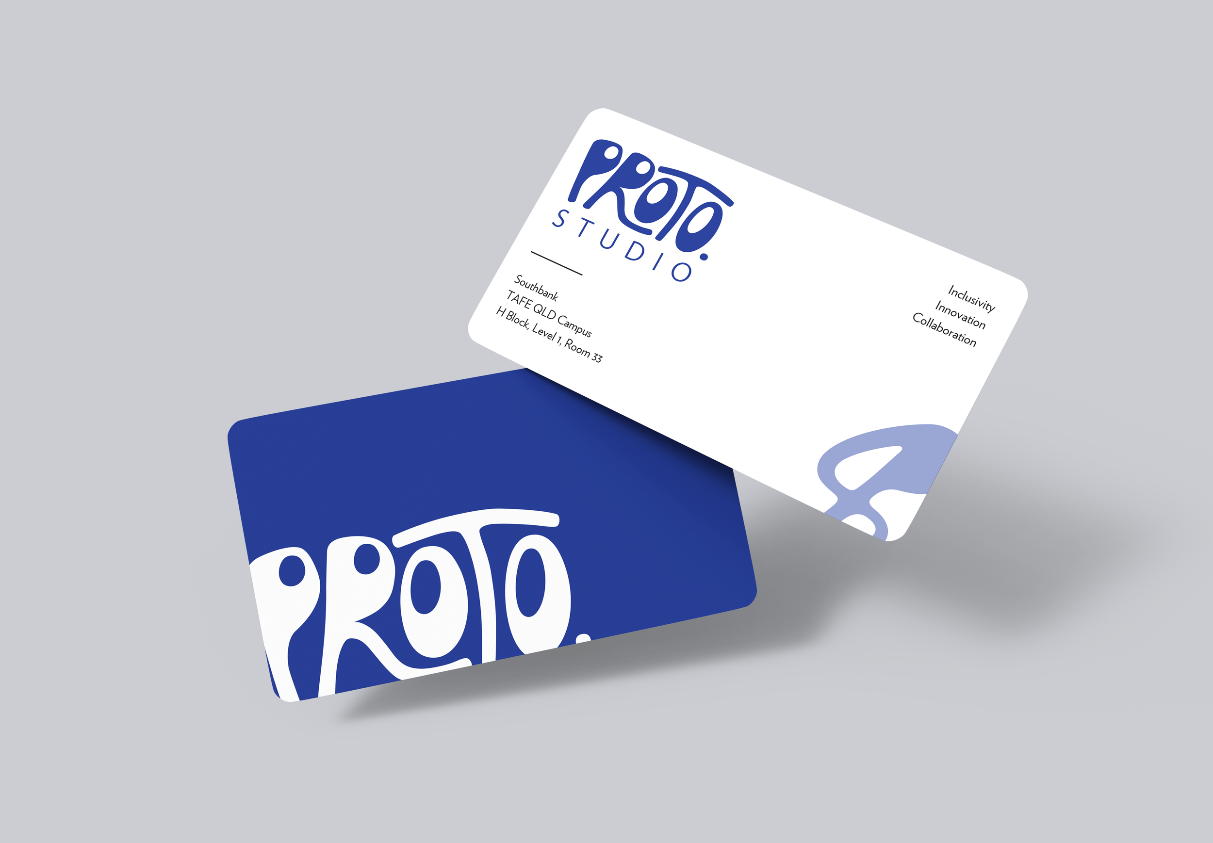
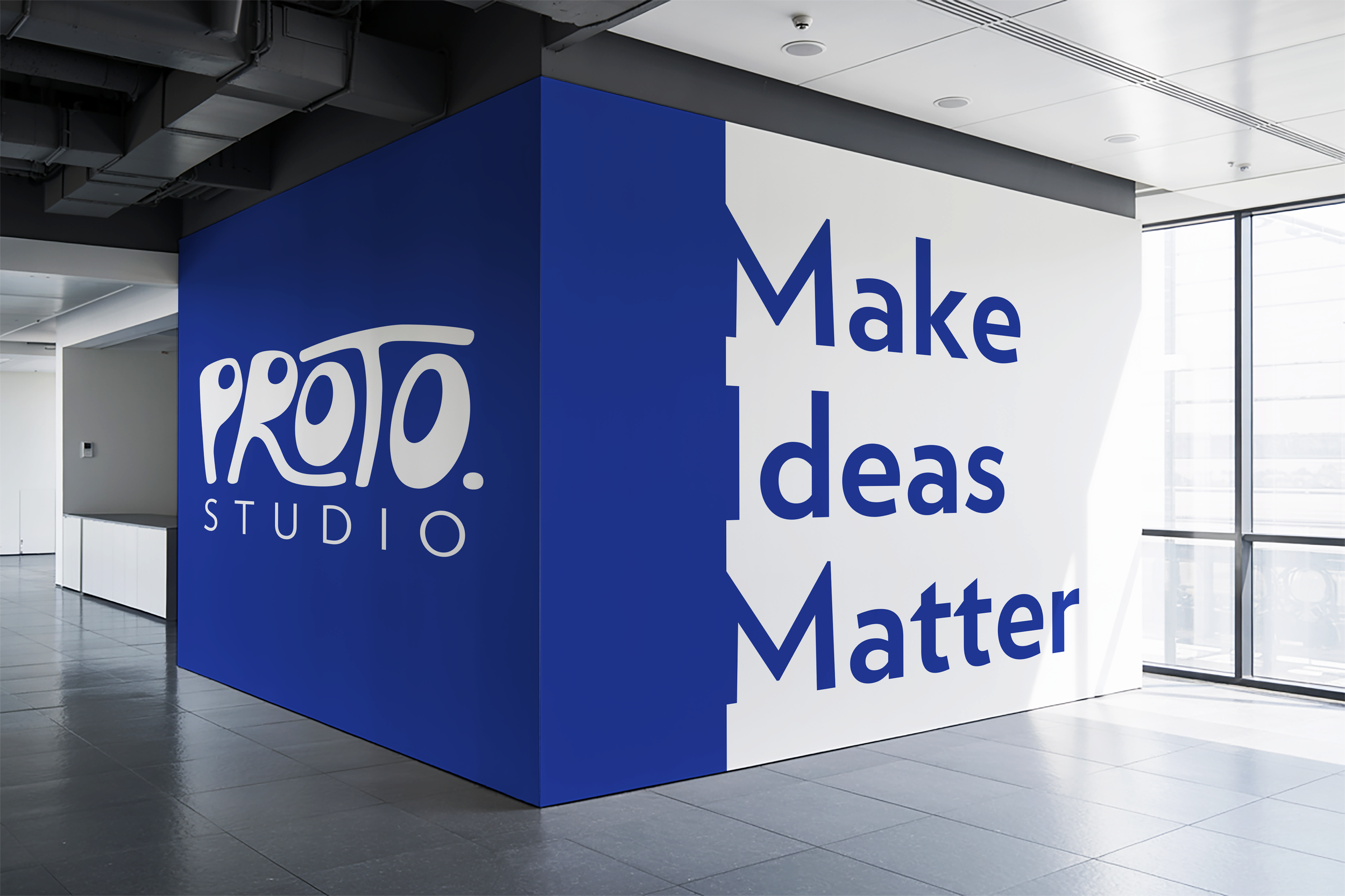
For a university assessment piece, we got the opportunity to rebrand a studio on campus. This meant that each group/individual creating a rebrand design concept worked towards creating a new brand to meet the new space’s requirements. This project become my rebrand titled Proto. Studio.
15 years ago, the Studio was established and the focus has always been on client work, however overtime the studio’s history was mostly lost. It features a reception, breakout rooms and studio recording rooms, where current day clients come in and give briefs. Showcases, events, and competitions happen in the room and have become its main purpose.
Aiming to create a more inclusive environment that reflects the studio’s new goals and focus, I established a clear visual identity that reflects the diverse identities and creative visions of our students. Emphasizing collaboration by sharing projects, postering peer-to-peer connection, and positioning the new studio as a creative home-base that empowers students to grow together.
Deliverables
Logo Suite
Colour Palette
Typography System
Mock Ups
Brand Style Guide

colour
palette
Creating a distinct and complimentary colour palette for the brand was an important part of the visual identity process and building brand recognition.
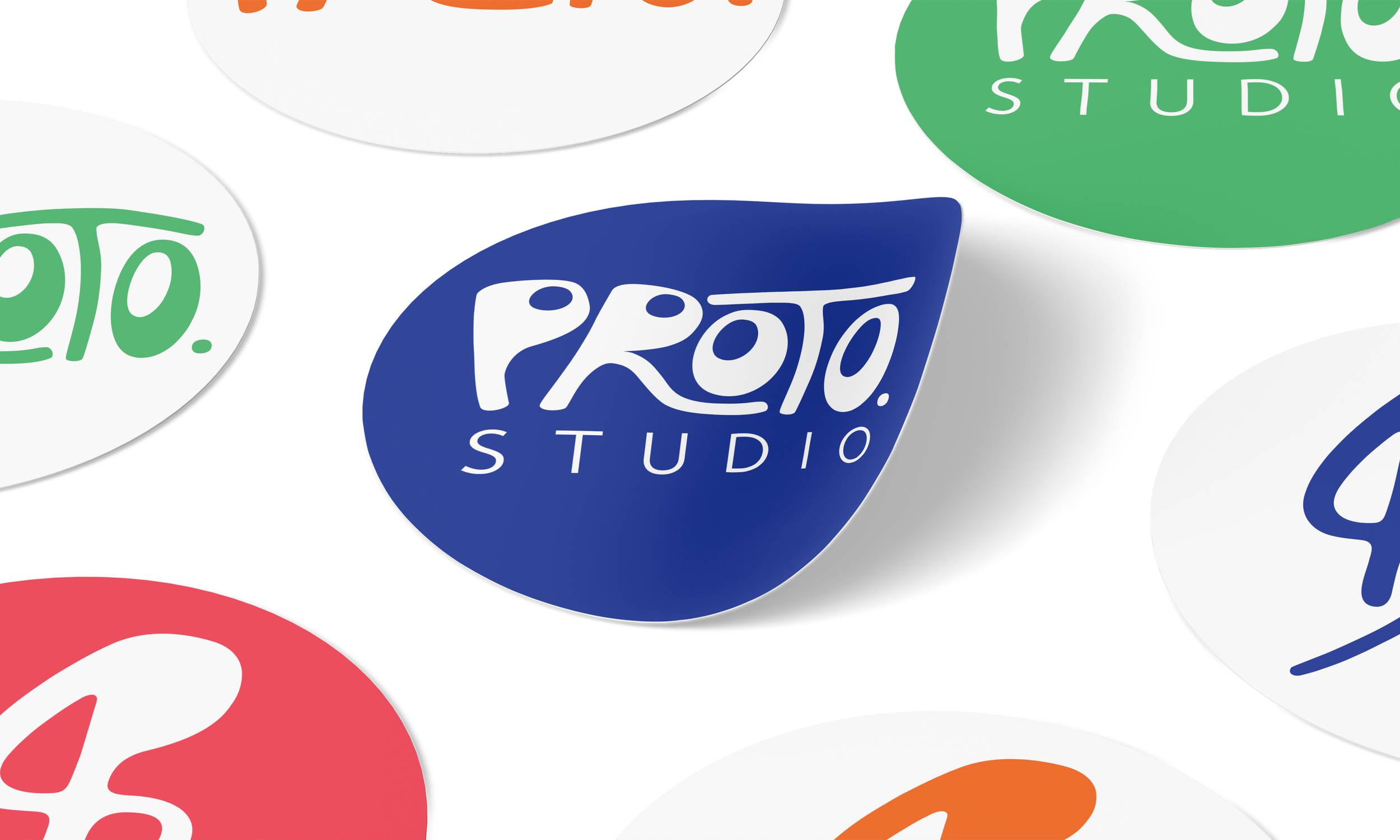
The Proto. Studio colour palette is bold, youthful, vibrant and connects with the University of Canberra and TAFE QLD’s original colour palettes, with adjustments to create a unique brand palette for Proto. and allows the studio to stand out on its own amongst the education facilities own branding itself.






brand typography
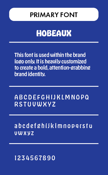
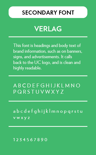
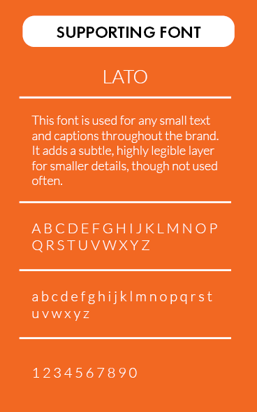
Making sure to use a consistent set of fonts across the brand is crucial in setting the tone for the visual identity. Focusing on using Hobeaux in the Logo, Verlag for body text, and Lato for any smaller captions works well because it creates a clear visual hierarchy that balances personality and readability.
Hobeaux brings bold, creative energy that is easily customizable for the logo that helps grab attention. Verlag provides clean and professional readability for longer text, and calls back to the original UC logo typography that is used in their branding. Lato adds a subtle, highly legible layer for smaller details, while not used as often. Together, they feel modern, cohesive, and expressive without clashing together.
ready to build
a brand?
Fill out the form and let’s build a bold and unique design together!